The design choice for their alerts, however, seems like it has an issue… It’s a shame, too, because USAA has a rather decent design otherwise (as far as banks go, I mean).
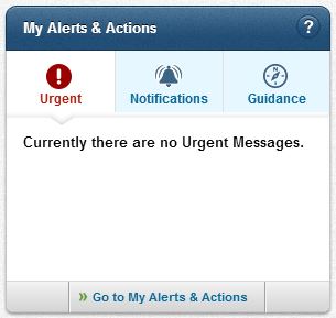
Would it really have been that difficult to go with a subtle blue icon when there are no alerts…? I would love it if they changed the icon color (and message bolding) only if there is an urgent alert. It would be much more noticeable that way.
Having a bright red exclamation with ‘Urgent’ written underneath, just to let me know there are no Urgent Messages seems like a really poor design choice.
Since it’s always red and has bold text displayed, I feel like this is simply going to train users not to pay attention to the alert window. If an urgent message every does show up, I doubt it would even get noticed.